
The first requirement I wrote for Big Peckture Studio was not a route map or a performance budget. It was a feeling: the photographs should get the first word.
That sounds obvious for a photography site, but it immediately creates a design problem. A photograph can make someone pause, remember, or imagine themselves inside a moment. It cannot, by itself, explain what a session is like, help a search engine understand where I work, teach the exposure triangle, or make an inquiry feel easy. The website needed to support all of those jobs without letting its machinery crowd the frame.
The build therefore became an exercise in restraint and separation. The homepage would create recognition. The service pages would create confidence. Field Notes would make room for explanation and experimentation. The inquiry layer would turn any of those paths into a conversation. They belong to one site, but they should not feel as though they were squeezed into one template.

The photograph gets the first word
The homepage is not a conventional page assembled from a hero, a grid, an about block, and a footer. It behaves more like a sequence of full-screen editorial spreads. Engagements, portraits, events, animals, places, and macro work each occupy a chapter with its own cover image, short premise, and route into the larger collection.
The distinction matters because the first question a visitor brings to a photographer is rarely technical. It is closer to: Does this person notice the world in a way I want to be remembered? A full-screen image can answer that faster than a paragraph can. The oversized condensed headings, deep ink-blue field, restrained gold accents, and compact navigation are there to frame that decision rather than compete with it.
The typography has two voices for the same reason. Barlow Condensed gives the chapter titles the scale of a magazine cover without consuming the entire width of the frame. Manrope handles navigation, descriptions, and controls with much less drama. One establishes atmosphere; the other gets out of the way and helps someone move.
Even the palette is doing more than supplying a brand. The navy is dark enough to let bright skin tones, foliage, water, and evening light hold the visual energy. Gold behaves like a focus indicator: it marks the current chapter, a label, or the next useful action. The warm paper color appears when the site asks the visitor to settle in and read. Those roles stay consistent even as the density of the pages changes.
Two directions for two different questions
The homepage has two axes. Scrolling vertically moves between bodies of work. Moving horizontally opens the selected chapter from its cinematic cover into a contact sheet. In the implementation, the page is a mandatory vertical scroll-snap sequence, and every portfolio chapter contains its own horizontal snap rail.
That interaction grew from a content problem, not a desire to make scrolling unusual. A cover photograph answers, What does this work feel like? A contact sheet answers, Can this photographer sustain that feeling across a complete set? Those are different forms of evidence, so I gave them different spaces and a physical relationship the visitor can understand.
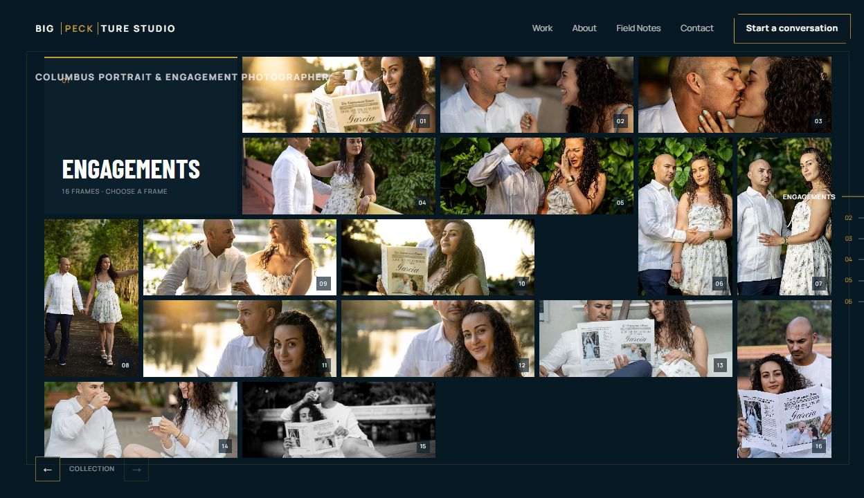
A static grid would have made all six categories available at once, but availability is not the same as clarity. It would also have flattened images with very different subjects and proportions into a single browsing mode. The two-axis structure lets the site stay immersive until the visitor asks for proof, then become dense at exactly the moment density is useful.
This is also why the chapter cover and the collection are separate states rather than one long overlay. Copy remains readable on the cover. Photographs get more room in the collection. The interface does not force description, controls, and sixteen frames to negotiate for the same patch of screen.
A service page is not a longer gallery
The homepage can create interest, but hiring a photographer asks for another kind of confidence. Someone considering an engagement session wants to know more than whether I have made strong engagement photographs. They want to know how much direction I give, how we choose a place, what the session will feel like, and whether they need to arrive with a finished plan.
That is why each body of work also has a dedicated route. The engagement page, for example, moves from a clear promise—“A little less posing. A lot more you.”—into a focused gallery, a four-part account of the process, practical ways to shape a session, and an inquiry form that already understands the kind of work being discussed. The page is not merely the homepage collection with more words. It is organized around the decisions a prospective client is trying to make.

The route boundary does several quiet jobs at once. It gives a visitor a stable page to save or share. It gives the writing enough space to be specific. It gives each service its own page title, description, canonical URL, heading structure, and structured data for Columbus and Central Ohio. Most importantly, it lets the homepage remain a portfolio instead of turning it into an accordion-shaped brochure.
I think of this as progressive disclosure for trust. The homepage asks for almost nothing and offers an immediate visual answer. A service page becomes more explicit because the visitor has asked a more explicit question. The form appears after the work and the process have done their part, and the relevant project type is already selected. None of that should feel like a funnel. It should feel as though the site remembers why someone arrived.
Field Notes needed a different room
The same separation made the journal possible. Field Notes is where I can write about composition, second-shooting, the moments between scheduled moments, or the 3D-printed microscope adapter I built for macro work. Those subjects deepen the photographic practice, but forcing them into the immersive portfolio would weaken both experiences.
The reading pages therefore shift onto the warm paper palette, narrow the measure, and allow the typography to settle into a more editorial rhythm. The photographs remain important, but they no longer have to carry the entire page. The change in surface tells the visitor that the mode has changed too: from looking to considering.
The interactive exposure-triangle guide pushed that architecture further. Aperture, shutter speed, and ISO are connected variables with visible consequences. Explaining them only in prose would ignore what a browser can do. The page lets a reader change all three, watch the simulated photograph respond, and see the combined exposure move away from or back toward balance.
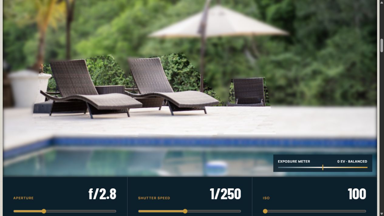
The simulator is intentionally contained inside the article rather than made into a separate app. The surrounding essay explains what each variable means, when the tradeoff matters, and why technical correctness is not the same as protecting the moment. The interactive part gives the reader a place to test that explanation. It is a small example of a larger design rule I want to keep using: when an idea is easier to understand as a system, the page should be allowed to behave like one.
The quiet architecture behind an image-heavy site
Photography makes performance part of the content model. The primary material is also the heaviest material, and a portfolio that makes people wait has already damaged the experience it was built to create.
The current site is built in Next.js, but the important choice is not the framework name. It is where the framework is allowed to show. The public structure arrives as ordinary headings, articles, figures, links, forms, and landmarks. Client-side behavior is concentrated in the places that require it: the portfolio experience, mobile navigation, the inquiry form, and interactive Field Notes. A person can encounter a richly designed interface while search engines and assistive technology still encounter a legible document.
Images follow the same principle. The opening photograph is loaded eagerly because it is the first experience. Later chapters are deferred until they are needed. Responsive source sets provide smaller and larger WebP derivatives rather than sending every screen the largest original. Descriptive alternative text carries subject and context, while decorative duplicates stay quiet. These choices are not polish added after the gallery was designed; they are the conditions that let the gallery work.

The architecture also repeats only what should be repeated. Navigation, footer, contact language, and inquiry behavior remain recognizable across the site. The page types do not. Portfolio chapters, service pages, the journal index, long-form notes, and the simulator have different densities because they support different kinds of attention.
That distinction has made the site easier to extend. A new body of work can become another chapter and service route. A new process note can join Field Notes. An explanation that needs an instrument can include one without redefining what the homepage is. Growth happens inside boundaries instead of by lengthening the same page forever.
Every route returns to a conversation
The site has several entrances: a full-screen engagement photograph, a local search for portrait photography, a shared article about composition, or a link to the microscope adapter. I did not want those paths to become isolated microsites, but I also did not want every page to interrupt itself with the same sales pitch.
So the routes branch while the conversation converges. Service pages end with an inquiry shaped by the service. Field Notes end with a contextual next step. The homepage carries the broader invitation: tell me what you are planning and what matters most, even if every detail is not settled yet. Email remains available as a plain fallback.
That language is part of the architecture. A contact form can ask for enough information to be useful without asking a potential client to perform certainty they do not yet have. “When?” is optional. “What matters most?” is more revealing than a rigid project specification. The system gathers what is needed to begin the human part of the work, then stops.
The website is part of the practice
I could have placed the photographs into a portfolio template and produced a perfectly functional site. Building Big Peckture Studio myself was valuable because the website could take its shape from the work instead of asking the work to fit the product boundaries of a portfolio platform.
That freedom made room for the two-axis gallery, service-specific journeys, technical Field Notes, and an exposure simulator living beside engagement photographs. It also made me confront the same question in two disciplines: which decisions need to remain visible, and which should disappear into the result?
Behind a finished photograph are exposure, focus, timing, composition, color, file handling, and a series of judgments made before the moment closes. Behind the website are routing, rendering, image derivatives, metadata, semantics, interaction states, and performance budgets. In both cases the machinery matters enormously, but the viewer should not have to reconstruct it to feel that the result works.
The photographs still get the first word.
The system exists to make sure they are not asked to say everything.
Paul Peck
Comments – Addendum Notes
Sign in with GitHub to comment or reply. Comments live as GitHub Discussions on the site repo — no ppeck.me account needed.